
Read your dashboard
Start with a question: is traffic growing, are more people taking action, or is revenue changing? Your dashboard brings those answers into one view.
Open a product from Your products, or use the product selector at the top of a dashboard. The screenshots in these guides use Jelto’s built-in sample data.
Choose what to explore
Select a metric above the chart to show its trend. KPI marks the product’s primary metric. The selected dates and filters apply to the report below.
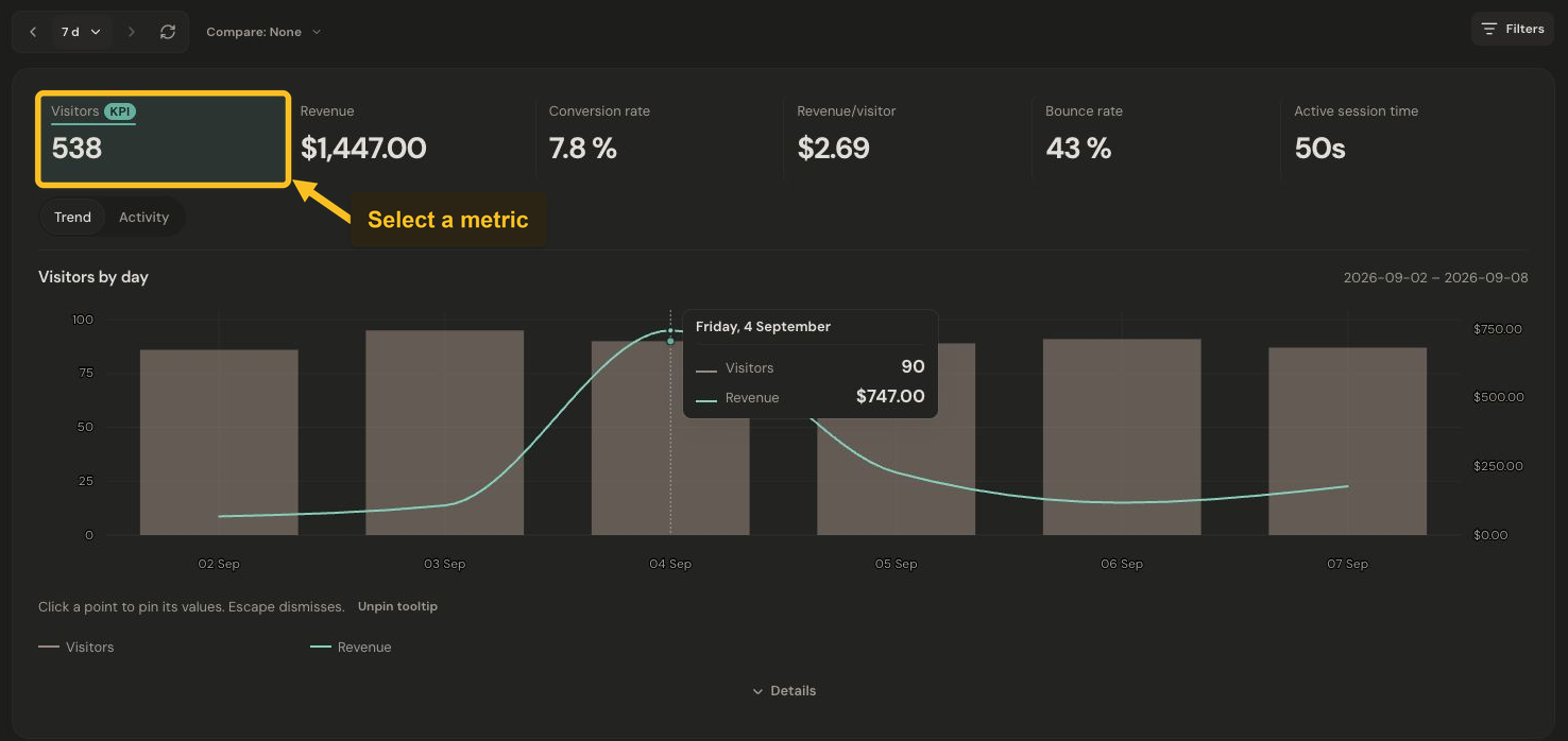
Select a metric to show its trend over the chosen dates. Select the image to view it at full size.
The cards you see depend on whether the product has website activity, app activity, or both. Website visitors and app installs describe different populations.
Choose dates and compare
- Open the date button beside the previous-period arrow. Choose a preset, or Custom for specific dates.
- Use Compare in the same menu to choose Previous period or Same period last year. Choose None to remove the comparison.
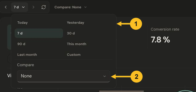
Choose a date range, then use Compare to add a comparison period. Select the image to view it at full size.
Use the arrows beside the date button to move between adjacent periods. The date printed above the chart tells you which period you are reading.
Read a point on the chart
Select a chart point to pin its values. Press Escape to dismiss the pinned details. Activity opens alternative views of aggregate website activity; Trend returns to the chart.
A dash is not automatically zero. Open Details where available to understand missing, limited, or unavailable measurements. Visitor counts use the product’s collection mode; in the cookieless example, the same browser can count again on another day.
Next: Filter your data or understand app usage.